Listen, I’m gonna tell you something that’ll piss off every technical analysis guru on YouTube: you don’t need to memorize 47 different candlestick patterns with ridiculous names like “Three Black Crows” or “Abandoned Baby” to trade successfully. I spent my first year trying to learn every single pattern in Steve Nison’s candlestick bible, and you know what? It was mostly a waste of time.
Here’s what actually matters: understanding what candlesticks are really telling you about the fight between buyers and sellers. Once you get that, you can read any chart like you’re reading a story. And trust me, after staring at these things for six years, they do tell stories – usually about how retail traders are about to get screwed.
I still remember the first time candlesticks actually “clicked” for me. I was watching Tesla during one of its crazy runs in 2020, and suddenly I could see it – the exhaustion in the buying, the sellers stepping in, the whole psychology of the crowd painted right there in red and green. It was like finally being able to read The Matrix. Cost me about $15,000 in losses to get to that point, but hey, expensive education is still education, right?
What Candlesticks Actually Are (And Why They’re Better Than Line Charts)
Let’s start with the basics because I see people screwing this up all the time. A candlestick shows you four crucial pieces of information: where price opened, where it closed, the highest point it reached, and the lowest point it hit. That’s it. But those four data points tell you everything about the battle that happened during that time period.
The colored box (the “body”) shows the open and close. Green (or white) means price closed higher than it opened – buyers won. Red (or black) means sellers won that round. The thin lines sticking out (the “wicks” or “shadows”) show you the extremes – how far price traveled before getting rejected.

Now here’s why this matters way more than a line chart: imagine you’re trying to figure out what happened at a party you missed. A line chart is like someone telling you “it was fun.” A candlestick chart is like getting the play-by-play – “Started chill, got crazy around midnight when Dave showed up, cops came at 2 AM, but everyone had already left through the back.”
I used to trade with line charts because I thought they were “cleaner.” Lost money consistently. Switched to candlesticks and suddenly could see when buyers were exhausted, when sellers were trapped, when a reversal was coming. It’s like switching from a flip phone to a smartphone – technically they both make calls, but one gives you way more useful information.
The Only Candlestick Patterns That Actually Matter
Forget the hundred patterns in textbooks. Here are the ones that actually make me money:
The Pin Bar (Or As I Call It, The “Nope” Candle)
This is a candle with a tiny body and a long wick on one side. It’s the market’s way of saying “we tried to go there, but NOPE.” When you see a pin bar at a key level, that’s the market rejecting that price hard.
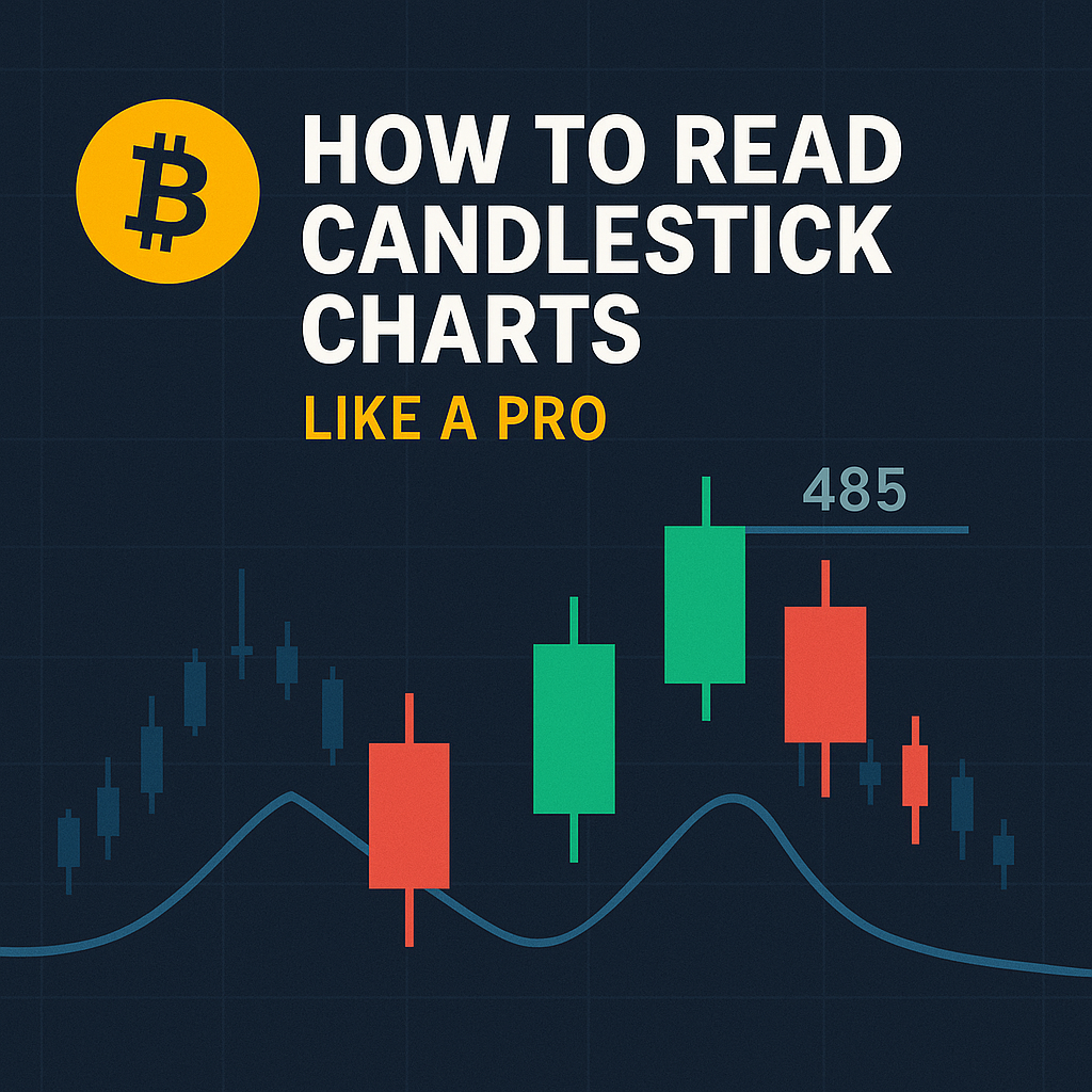
I made $3,000 last week on SPY puts because of a pin bar. SPY tried to break above 485 (major resistance), shot up to 487, then got smacked down hard, leaving a massive upper wick. That pin bar was screaming “shorts incoming!” Bought puts, SPY dropped to 480 the next day.
The key with pin bars: location matters more than the pattern itself. A pin bar in the middle of nowhere? Worthless. A pin bar at a major support/resistance level, trendline, or moving average? That’s money.
The Engulfing Pattern (The “Momentum Shift”)
This is when one candle completely swallows the previous candle’s body. It’s like watching someone get dominated in an argument – they were talking tough, then the other person just completely shuts them down.
Bullish engulfing: small red candle followed by a big green candle that completely covers it. Bears were in control, then bulls said “sit down” and took over.
Bearish engulfing: opposite – small green candle gets swallowed by a big red one.
But here’s the secret nobody tells you: most engulfing patterns are fake-outs. The ones that work are at the END of moves, not in the middle. I look for engulfing patterns after 5+ candles in the same direction. That’s when they actually signal exhaustion and reversal.
The Doji (The “Nobody Knows WTF Is Happening” Candle)
A doji has almost the same open and close, creating a cross or plus sign. It means buyers and sellers fought to a draw. By itself, it means nothing. But at the right spot? It’s gold.
Doji at the top of a strong uptrend = buyers losing steam, potential reversal. Doji at the bottom of a downtrend = sellers exhausted, possible bounce. Doji in the middle of nowhere = market taking a smoke break, ignore it.
I learned this the hard way. Saw a doji, immediately bought calls thinking “reversal!” Stock kept dropping. Now I wait for confirmation – a doji followed by a strong directional candle is the real signal.
Inside Bars (The “Coiled Spring”)
An inside bar is completely contained within the previous candle’s range. It’s like the market is taking a breath, coiling up energy for the next move. These are my favorite for options trades because the breakout is usually explosive.
Apple loves inside bars. I scan for them on the daily chart. When I see 2-3 inside bars in a row, I know a big move is coming. The trick is you don’t guess the direction – you wait for the breakout and jump on. Last month, AAPL had three inside days, broke above, and ran 5% in two days. My calls printed beautifully.
Reading Candlesticks in Context (This Is Where the Magic Happens)
Individual patterns are like words. But reading charts is about understanding sentences and paragraphs. Here’s how I actually read a chart:
The Story of Size
Big candles = strong conviction. Small candles = uncertainty. When you see candle bodies getting progressively smaller as price approaches resistance, that’s buyers losing confidence. When candles get bigger as price falls, that’s panic selling accelerating.
Watch what happens to candle size at key levels. If SPY approaches 500 and the green candles start shrinking while wicks get longer, buyers are struggling. That’s my signal to start looking for short entries.
The Volume Confirmation
A big green candle on tiny volume? That’s suspicious as hell. Like someone yelling “this stock is going to the moon!” in an empty room. But a big green candle on massive volume? That’s institutions loading up.
I always have volume displayed below my candlestick charts. A pattern without volume is like a gun without bullets – looks scary but can’t actually hurt you. My rule: if a breakout doesn’t have at least 1.5x average volume, I don’t trust it.
The Wick Story
Wicks tell you where price got rejected. Long upper wick = sellers defended that level. Long lower wick = buyers stepped in to defend.
Multiple candles with long upper wicks at the same level? That’s resistance being defended hard. I’ve seen Tesla test 900 five times with long upper wicks each time. Guess what happened the sixth time? It failed again, and I made bank on puts.
Here’s a pro tip: when you see equal length wicks on top and bottom (like a plus sign), the market is confused. Stay away unless you like gambling.
Time Frames: The Most Important Thing Nobody Talks About
A pattern on a 1-minute chart means absolutely nothing if the daily chart is trending the opposite direction. This is where most new traders get destroyed – they see a “perfect” bullish pattern on the 5-minute chart and buy calls, not realizing the daily chart is in a death spiral.
My Multiple Time Frame System
I use three time frames for every trade:
Higher Time Frame (Daily/Weekly): This is the ocean current. It tells me the overall trend and major levels. I NEVER trade against the daily trend unless I have a damn good reason.
Trading Time Frame (1-hour/4-hour for swings, 5-min/15-min for day trades): This is where I look for entries. The patterns here need to align with the higher time frame trend.
Lower Time Frame (1-min/5-min): This is for fine-tuning entries and exits. I’ll drop down here to get a better price, but the decision to trade was already made on higher time frames.
Example: SPY daily shows uptrend, bouncing off 50-day moving average. I drop to the hourly and see a bullish engulfing pattern. Then I go to 5-minute to time my entry after a small pullback. Three time frames, one story, better entry.
The Time Frame Trap
Here’s how people blow up accounts: they start on the daily chart, see it’s bearish, decide to look for shorts. Then they drop to the 1-minute chart, see a bullish pattern, think “oh this looks good,” forget about the daily entirely, and buy calls. Market drops, they’re confused why their “perfect pattern” failed.
Don’t be these people. Write your bias from the higher time frame on a sticky note if you have to. “DAILY IS BEARISH – ONLY SHORTS” stuck to your monitor can save you thousands.
Candlesticks and Support/Resistance (Where the Real Money Is Made)
Candlestick patterns mean nothing in isolation. It’s like finding a $100 bill – great if it’s on the sidewalk, worthless if it’s in a Monopoly box. Location is everything.
How to Identify Key Levels
Forget complicated indicators. Here’s how I find the levels that actually matter:
Previous highs and lows: Price has memory. If SPY bounced hard at 470 twice before, it’ll probably react there again. I mark these levels and watch how candles behave when price returns.
Round numbers: The human brain loves round numbers. 100, 200, 500, 1000 – these act like magnets. Watch how many times Tesla respects 700, 800, 900. It’s not coincidence; it’s psychology.
Moving averages on higher time frames: The 50-day and 200-day moving averages on the daily chart are like brick walls. When I see a pin bar or engulfing pattern at these levels, I take notice.
Gap fills: Markets hate gaps and usually fill them. When I see exhaustion candles right as a gap fills, that’s often a reversal point.
The Confluence Zones
This is where you make the big money. When multiple levels converge, that zone becomes super powerful.
Example from last month: QQQ had the 50-day MA at 400, previous resistance at 401, and the 61.8% Fibonacci at 400.50. When price hit that zone and formed a bearish engulfing pattern, I loaded puts hard. QQQ dropped to 390 in three days. That’s the power of confluence.
How I Actually Trade Using Candlesticks
Let me walk you through my actual process, not some theoretical BS:
My Morning Routine
6:00 AM (Pacific): Coffee and check futures. I’m looking at the ES (S&P futures) candlesticks on the hourly. Are we trending or ranging? Any major patterns forming overnight?
6:15 AM: Pull up daily charts of my watchlist (usually 10-15 stocks). Mark any significant patterns from yesterday. Did anything close with a reversal pattern? Any inside days setting up?
6:30 AM: Check the sectors (XLF, XLK, XLE, etc.). I want to know which sectors are strong/weak. If tech has bearish engulfing patterns while financials have bullish ones, I know where to focus.
9:00 AM: Switch to 5-minute charts for my main watches. I’m looking for the opening drive – is there conviction or confusion?
9:30 AM: Market opens. I watch the first three 5-minute candles religiously. They often set the tone for the day. Big green candles with small wicks = strong bullish day likely. Doji or spinning tops = choppy day, I might sit out.
The Actual Trade Execution
Let’s say I’m watching NVDA for a long setup:
- Daily chart shows uptrend, bouncing off 20-day MA
- Hourly shows a bull flag forming
- I set an alert for a break above flag resistance at 650
- Alert hits, I check the 5-minute
- I see a strong green candle breaking out with volume
- I wait for a pullback (usually 2-3 candles)
- When I see a hammer or bullish engulfing on the pullback, I enter
- Stop loss goes below the pullback low
- Target is the measured move from the flag
This systematic approach using multiple time frames and waiting for candlestick confirmation has completely transformed my trading. Yeah, I miss some moves by waiting for confirmation, but I also avoid a ton of false breakouts.
Common Candlestick Mistakes That Will Drain Your Account
Mistake 1: Trading Patterns in Isolation
“Look, a hammer pattern! Time to buy!” No, no, no. A hammer in a downtrend is just a pause before more selling. A hammer at support after a selloff? Now that’s interesting.
I used to trade every pattern I saw. Lost money consistently. Now I only trade patterns at key levels with volume confirmation. My win rate went from 30% to 65%.
Mistake 2: Ignoring the Trend
“The trend is your friend” is a cliché because it’s true. Trading bearish patterns in a strong uptrend is like trying to stop a freight train with your hands. You might get lucky once, but eventually, you’re getting flattened.
My rule: In uptrends, I only take bullish patterns or bearish patterns at major resistance for quick scalps. In downtrends, opposite. Swimming with the current, not against it.
Mistake 3: Not Waiting for Confirmation
See a doji at resistance? Don’t immediately buy puts. Wait for the next candle. If it’s a strong bearish candle, now you have confirmation. If it’s a strong bullish candle, that doji meant nothing.
Confirmation costs you some profit but saves you from way more losses. I’d rather miss the first 20% of a move and catch the middle 60% than try to catch a falling knife.
Mistake 4: Using Too Many Time Frames
I knew a guy who had eight time frames open for one stock. By the time he analyzed all of them, the move was over. Analysis paralysis is real.
Stick to three time frames max. More than that and you’re just confusing yourself. The market moved while you were busy being thorough.
Mistake 5: Forgetting About News
The most perfect candlestick pattern means nothing if earnings are after the close. I once had a textbook bullish setup on NFLX, bought calls, then remembered earnings were that night. Stock dropped 15% after hours. There went $2,000.
Always check the economic calendar and earnings dates. Candlesticks show you what happened, not what’s about to happen when news hits.
Advanced Candlestick Techniques That Actually Work
Once you’ve mastered the basics, here’s the next level stuff:
The Failed Pattern Trade
When a “perfect” pattern fails, that’s often a stronger signal than the pattern itself. If everyone sees a head and shoulders pattern and it doesn’t break down, shorts are trapped and the squeeze up is violent.
I love failed breakdowns. Stock breaks below support with a big red candle, everyone shorts it, next candle completely reverses and closes above support. All those shorts are now underwater and have to cover. I buy calls on the reclaim and ride the short squeeze.
The Three Candle Rule
After a big move (5%+ in a day), I wait for three candles on the daily chart before making a decision. First candle is emotional reaction, second is reassessment, third shows true direction.
This saved me so much money on FOMO trades. Stock rips 10%, I want to chase, but I wait three days. Usually by day three, it’s pulling back and I get a better entry, or it’s continued higher and I skip a likely top.
The Trap Patterns
These are patterns designed to fool retail traders. The classic is the “fake breakdown” – stock breaks below support, retail shorts pile in, then it reverses hard. The tell? The breakdown candle has a long lower wick, showing buyers stepped in immediately.
Market makers love creating these. They know everyone has the same support level marked, so they push price just below to trigger stop losses and induce shorts, then reverse it. When I see a support break with immediate rejection (long lower wick), I’m buying, not selling.
Reading Candles for Different Market Conditions
Markets aren’t always the same. Trending markets need different analysis than ranging markets.
Trending Markets
In strong trends, traditional reversal patterns often fail. That “perfect” bearish engulfing in an uptrend? Probably just a bull flag. Instead, I look for continuation patterns:
- Bullish flags (small red candles after big green ones)
- Three white soldiers (three consecutive green candles, each closing higher)
- Rising three methods (google this one, it’s money in uptrends)
In trends, I trade pullbacks to moving averages, not reversal patterns. If SPY is in a strong uptrend, I’m buying every pullback to the 20-day MA that shows a bullish candle, not trying to short random bearish patterns.
Ranging Markets
When markets go sideways, reversal patterns work great. Every touch of range resistance with a bearish pattern is a short, every support bounce with a bullish pattern is a long.
The key is identifying the range. I need to see at least two touches of both support and resistance with reversal candles. Then I trade the range until it breaks. Some of my most consistent profits come from trading SPY when it’s stuck in a 5-point range for weeks.
Volatile Markets
High volatility makes patterns less reliable but more profitable when they work. Wide-range candles become normal, so I focus on extremes – the biggest candles with the longest wicks.
In volatile markets, I reduce position size but widen targets. Patterns might be messier, but the moves are bigger. That pin bar might have a 3-point wick instead of 1-point, but the reversal could be 10 points instead of 3.
Building Your Candlestick Trading System
Reading candles isn’t enough – you need a system. Here’s mine:
The Setup Criteria
For me to take a trade based on candlesticks:
- Pattern must be at a key level (support/resistance/moving average)
- Volume must confirm (higher than average)
- Multiple time frames must align
- Risk/reward must be at least 1:2
- No major news/earnings within 24 hours
If all five aren’t met, I pass. Yes, I miss trades. But I miss more losses than winners.
The Entry Rules
- Reversal patterns: Enter on close of confirmation candle
- Breakout patterns: Enter on break with stop at pattern low
- Continuation patterns: Enter on pullback to support
Never chase. If I miss the entry, I wait for the next setup. The market always provides another opportunity.
The Exit Strategy
- Take 25% profit at 1:1 risk/reward
- Take 50% at initial target
- Trail stop on remainder
This way I lock in profits while letting winners run. Nothing worse than watching a 100% winner turn into a loser because you got greedy.
Your 30-Day Candlestick Mastery Plan
Week 1: Learn the basic patterns. Focus only on pin bars, engulfing, and doji. Practice identifying them on historical charts.
Week 2: Add support and resistance. Mark levels on your charts and see how candles react at these levels.
Week 3: Incorporate multiple time frames. Start with daily and hourly, get comfortable with the relationship.
Week 4: Paper trade using only candlestick patterns at key levels. Journal every trade.
After 30 days, you’ll see charts differently. They’ll tell you stories about fear, greed, exhaustion, and euphoria. You’ll spot opportunities others miss and avoid traps that catch most traders.
The Truth About Candlestick Mastery
Here’s what nobody wants to admit: you can know every pattern perfectly and still lose money. Candlesticks are just a tool, like a hammer. Knowing how to swing a hammer doesn’t make you a carpenter.
What makes you profitable is combining candlestick reading with risk management, position sizing, and emotional control. The best candlestick reader in the world will blow up their account if they trade too big or can’t handle losses.
I’ve been reading candlesticks for six years, and I still misread them sometimes. The difference now is when I’m wrong, I lose small. When I’m right, I win big. That’s the edge – not being perfect, but being profitable.
Start simple. Master a few patterns at key levels. Build from there. And please, for the love of all that is holy, stop trying to memorize every pattern with a weird Japanese name. Focus on understanding what the candles are telling you about supply and demand, fear and greed.
The market speaks to us through candlesticks. Most people are too busy looking for the perfect pattern to actually listen. Don’t be most people. Learn to listen, and the charts will tell you exactly what’s about to happen.